Bringing clarity to document management and compliance

Enterprise e-signature platforms live in a paradox. They promise to eliminate paperwork friction, yet many become friction themselves. Complex interfaces. Confusing workflows. Security features that protect documents while frustrating users. The technology works, but the experience doesn't.
VSiD faced this exact challenge with their flagship product, Virtual Signature. Their platform delivered robust security and compliance capabilities that enterprise clients required. The technical foundation was solid. But the interface had fallen behind modern UX standards, creating adoption barriers and operational inefficiencies.
Beyond product challenges, VSiD needed to establish their corporate brand identity. As a company offering multiple digital identity solutions beyond e-signatures, they required a website that could communicate their full portfolio while maintaining cohesive brand presence. Each solution served different markets with different needs, yet they all needed to feel part of one trusted company.
The challenge was twofold: modernize Virtual Signature's user experience across end-users and administrators, and build a corporate website that presented VSiD's solution portfolio with clarity and credibility.
Tenscope is a terrific team, committed, collaborative, and fast. They transformed our platform with a much more user-friendly design, saving us time, cutting costs, and helping us get to market sooner. Their expertise and turnaround are 10 out of 10, no question.
David Kern, CEO at VSiD
Understanding dual audiences and complex needs
E-signature platforms serve fundamentally different user types with different needs, mental models, and success criteria.
End-users interact with the platform occasionally. They receive a document link, sign it, and move on. They don't want to learn the system—they want to complete one task quickly and correctly. Every moment of confusion is a moment they question whether to proceed.
Their priorities are simple:
- Understand what's being requested immediately
- Complete signing without errors
- Feel confident the signature was captured properly
- Never wonder "what do I do next?"
Mid-users work in the platform daily. They're administrators, compliance officers, and operations staff managing document workflows for their organizations. They create signing requests, track status, review completed documents, and ensure regulatory compliance.
Their priorities are operational:
- Process documents efficiently in bulk
- Monitor signing status across multiple cases
- Identify bottlenecks or stuck workflows quickly
- Access audit trails and compliance data easily
- Customize workflows for different document types
Through stakeholder interviews and UX audit, we mapped pain points specific to each group. The redesign strategy needed to optimize both experiences simultaneously without compromising either.
Redesigning for end-users: clarity at every step
End-user workflows received a complete rebuild around progressive disclosure and clear guidance.
Login and authentication
The original authentication flow felt like a security interrogation. Multiple screens. Unclear requirements. Error messages that didn't explain what went wrong or how to fix it.
We simplified the entire experience into a clear, linear flow. Each authentication step explains why it's needed and what information is required. Error states provide specific guidance—"Your verification code has expired. Click here to request a new one" instead of generic "Authentication failed" messages.
Visual progress indicators show users where they are in the process. No one should wonder how many more steps remain.
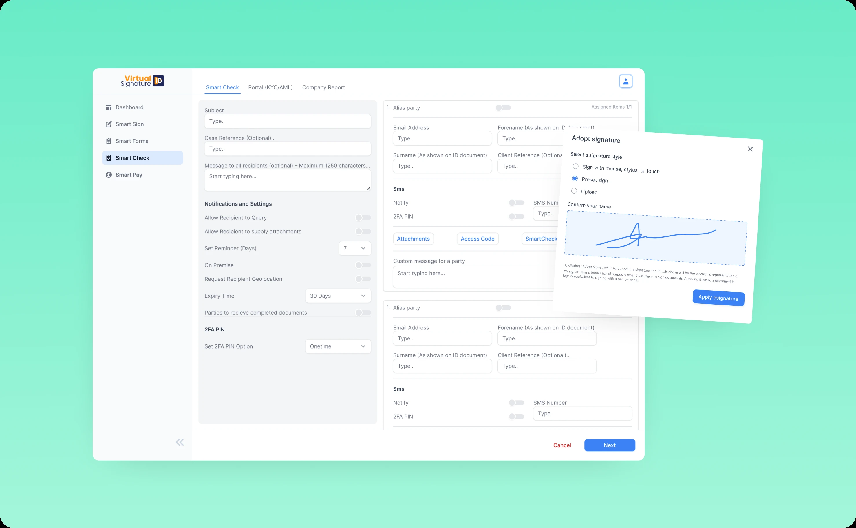
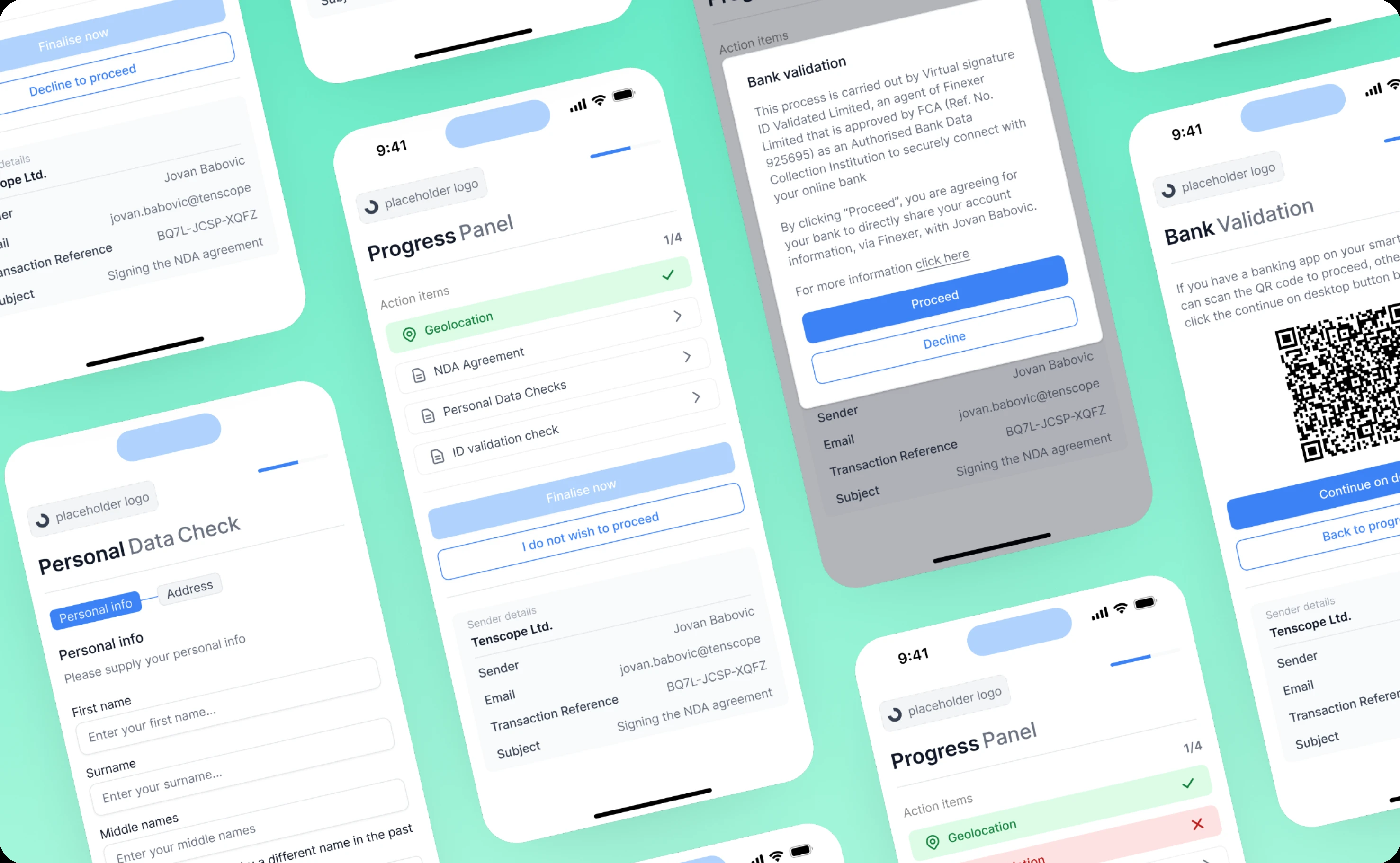
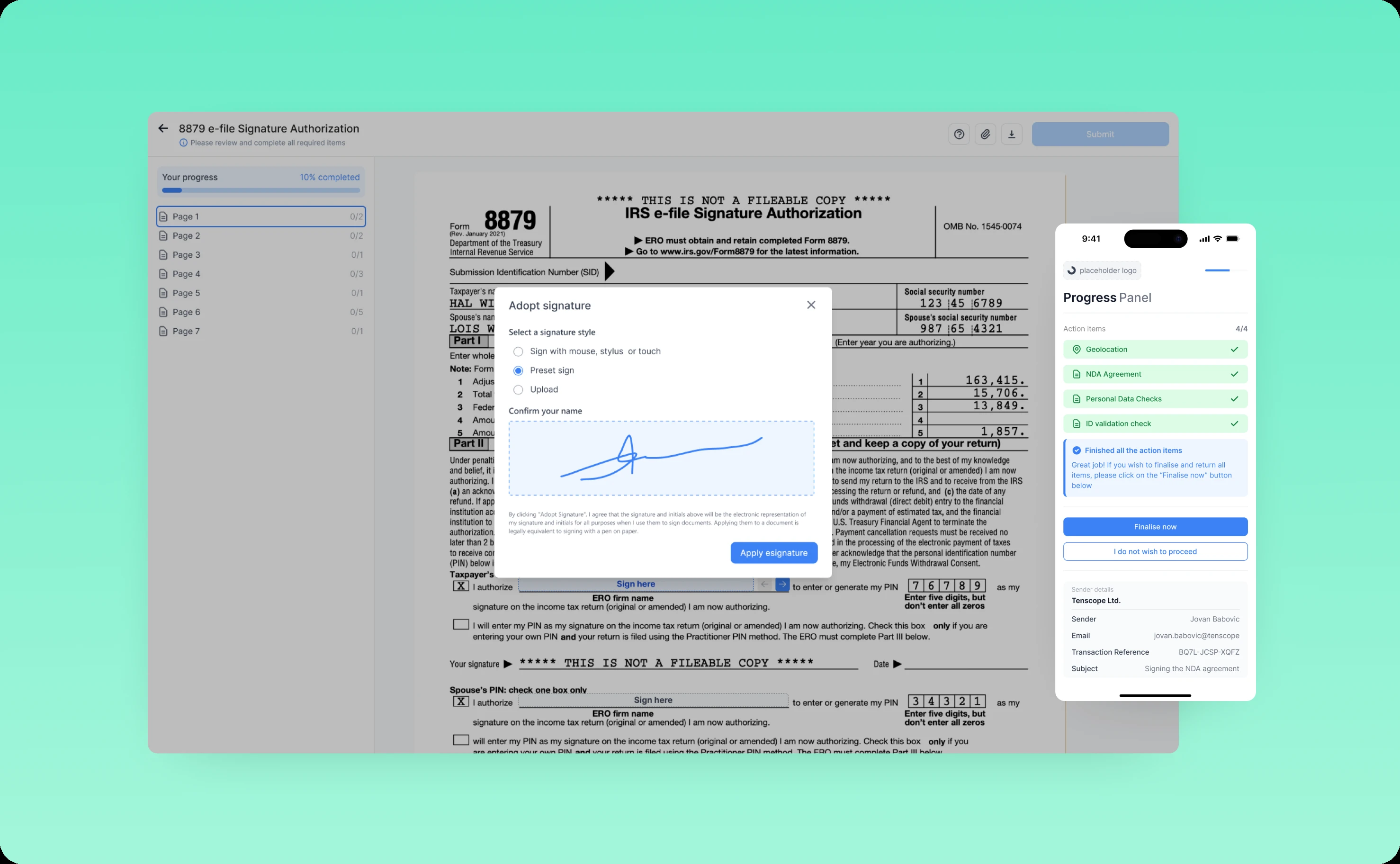
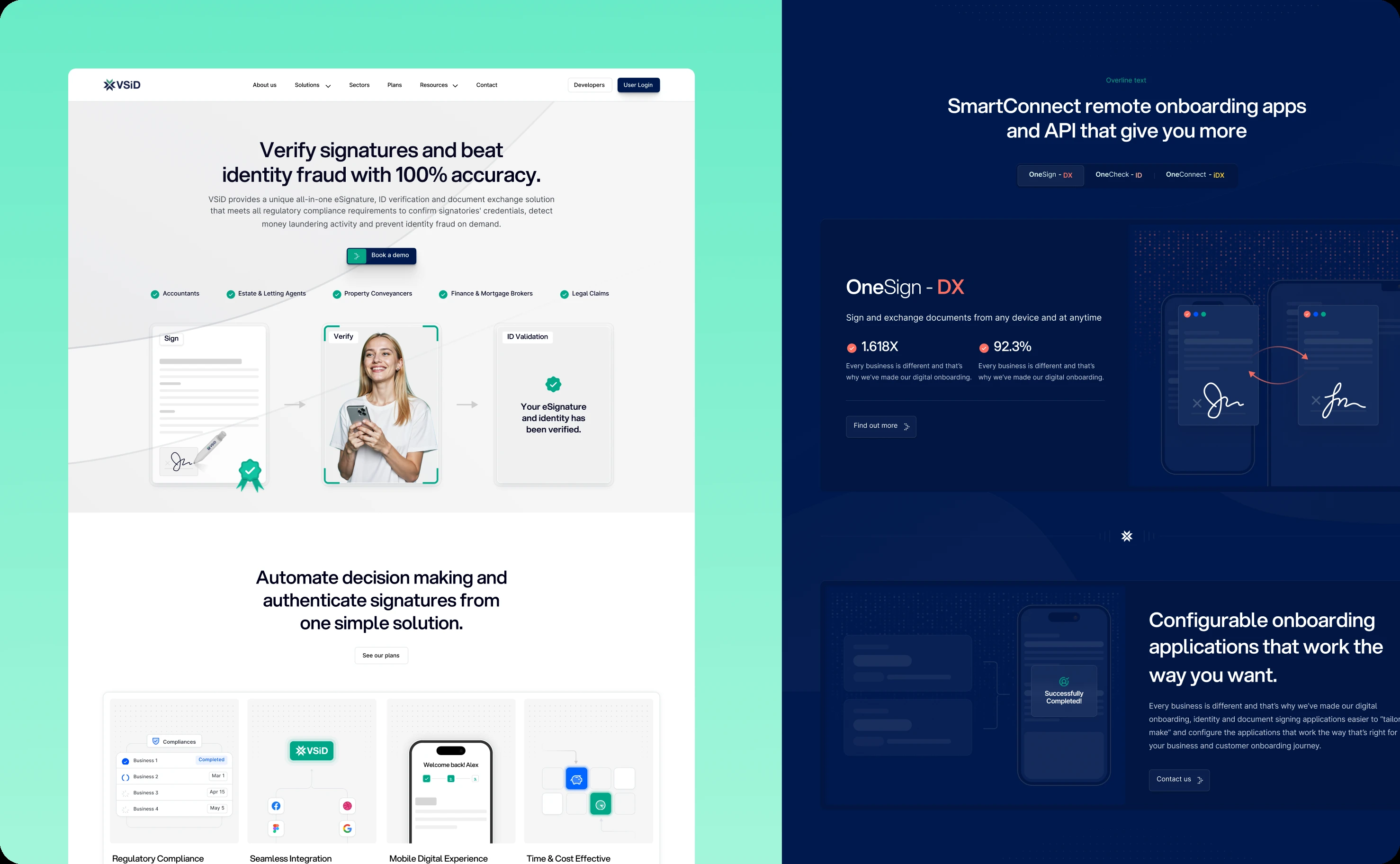
Document signing
The core signing experience is where most end-users spend their time. It needed to feel effortless.
We introduced a Progress Panel that tracks all required actions at a glance. Need to sign in three places, initial two sections, and verify your identity? The panel shows each task with clear completion states. Users always know what's done and what remains.
Multiple signature options accommodate different preferences and contexts. Drawing with a mouse or finger. Uploading an image of a physical signature. Typing a name with automatic font styling. Each method feels natural for its use case.
Confirmation and error prompts provide appropriate feedback at critical moments. Successfully signed? Clear visual confirmation with a summary of what was submitted. Missed a required field? The system highlights it with specific guidance on what's needed.
The redesigned interface reduces signing errors significantly while making the experience feel guided rather than gated.
Verification and validation
Advanced verification—bank validation, personal data collection, identity checks—can feel invasive when poorly designed.
We rebuilt these flows around contextual explanation. Before requesting sensitive information, the interface explains why it's needed, how it's used, and how it's protected. Transparency builds trust. Trust increases completion rates.
Field validation happens in real-time with constructive feedback. Entered a bank account number in the wrong format? The system corrects it automatically or provides a clear format example. No one should fail verification because they didn't know the expected input format.
Redesigning for mid-users: control and efficiency
Supporting features matter as much as core analytics. Clunky billing or team management undermines the entire experience.
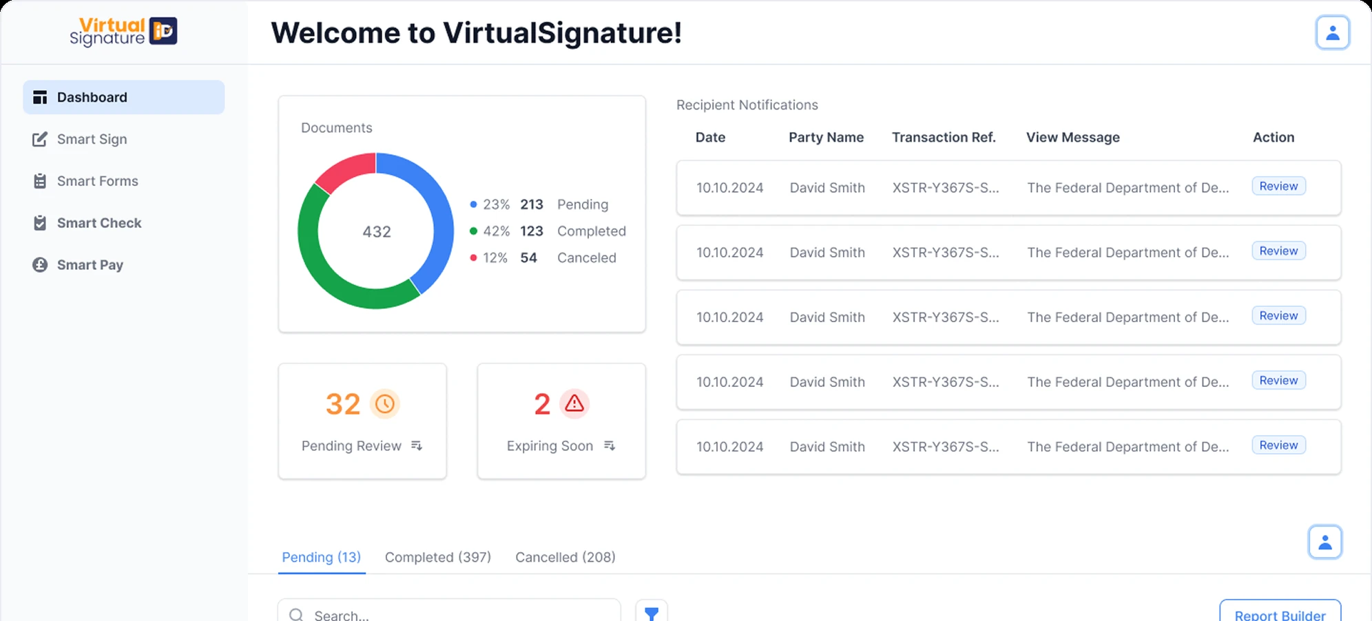
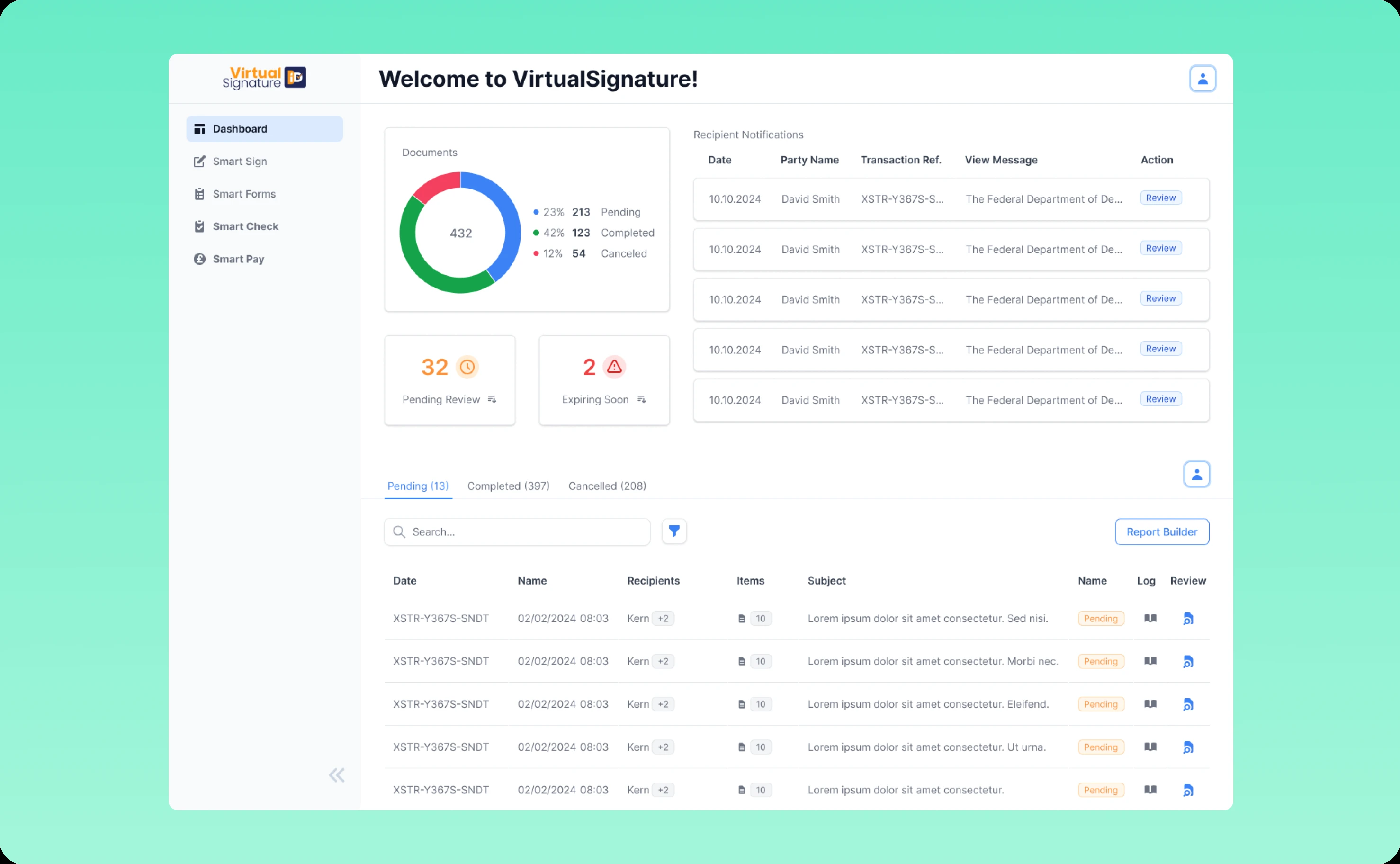
Dashboard redesign
The original dashboard was information overload. Everything competed for attention. Nothing stood out. Finding specific cases required hunting.
We rebuilt the dashboard as a true command center. Key metrics surface immediately: pending signatures, completed documents, approaching deadlines, compliance flags requiring attention. Mid-users can assess their entire workload at a glance.
Case filtering and search support multiple workflows. Need to find all documents awaiting signatures from a specific department? One filter. Looking for completed cases from last quarter for an audit? Another filter. The interface adapts to how different mid-users actually work.
Activity logs provide real-time updates on signing progress without requiring manual status checks. When a document gets signed, the dashboard updates immediately. No more refresh clicking or wondering if something moved forward.
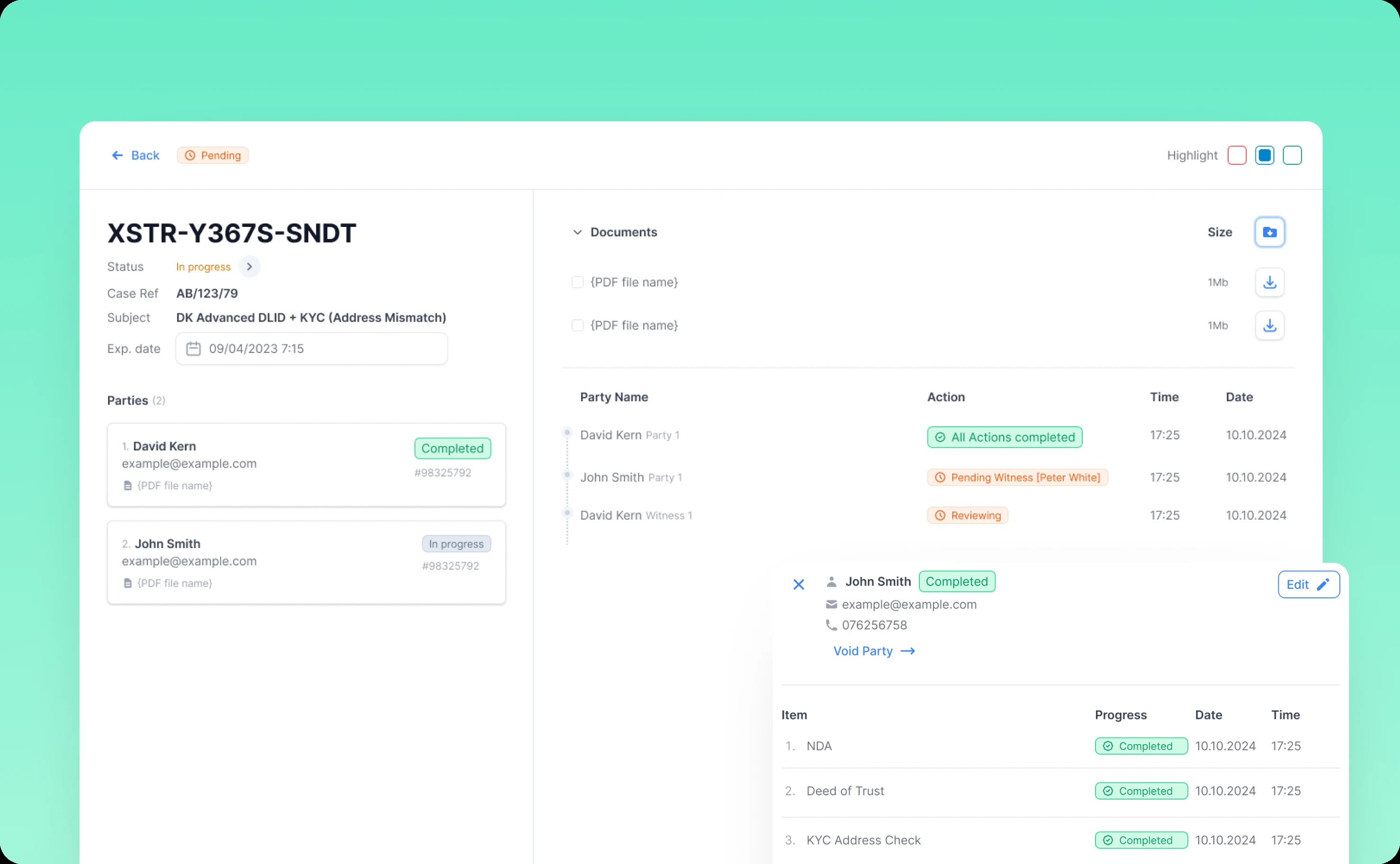
Case review workflow
Reviewing and approving signed documents is a repetitive task that accumulates quickly. The original workflow required opening each case individually, checking details, and navigating back to the list.
We streamlined the entire process. Bulk actions let mid-users process multiple similar cases at once. Approving ten completed NDAs shouldn't require ten separate clicks through ten separate screens.
Preview capabilities show document details without full navigation. Hover over a case to see signing status, key dates, and participant information. Only cases requiring deeper review need full screen opens.
Approval workflows are context-aware. Simple documents get simplified approval. Complex contracts surface relevant details automatically—who signed, when, any special conditions, audit trail highlights.
Smart Sign and Smart Check
These automated tools needed interfaces that made their intelligence accessible.
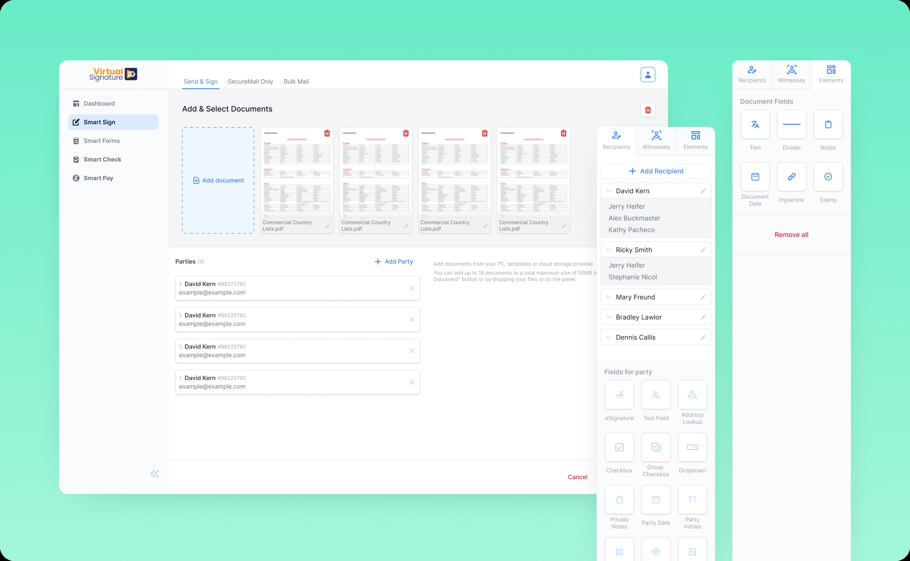
Smart Sign now features an intuitive document upload flow with drag-and-drop support. Recipient configuration is flexible—add individuals, define roles, set signing order. The editor makes field placement visual and obvious. Drag a signature field. Drop it where needed. Set requirements. Done.
Smart Check automated validation works in the background but surfaces findings clearly. Documents with potential issues get flagged with specific explanations. Mid-users can review, override, or investigate without digging through logs.
Navigation and settings
We completely restructured platform navigation around user mental models rather than technical architecture.
Primary actions moved to expected locations. Settings became accessible and organized logically. Customization options gained clear descriptions explaining what each setting actually does.
The navigation system maintains consistency across all features. The same patterns work everywhere, reducing cognitive load as mid-users move between different tools.
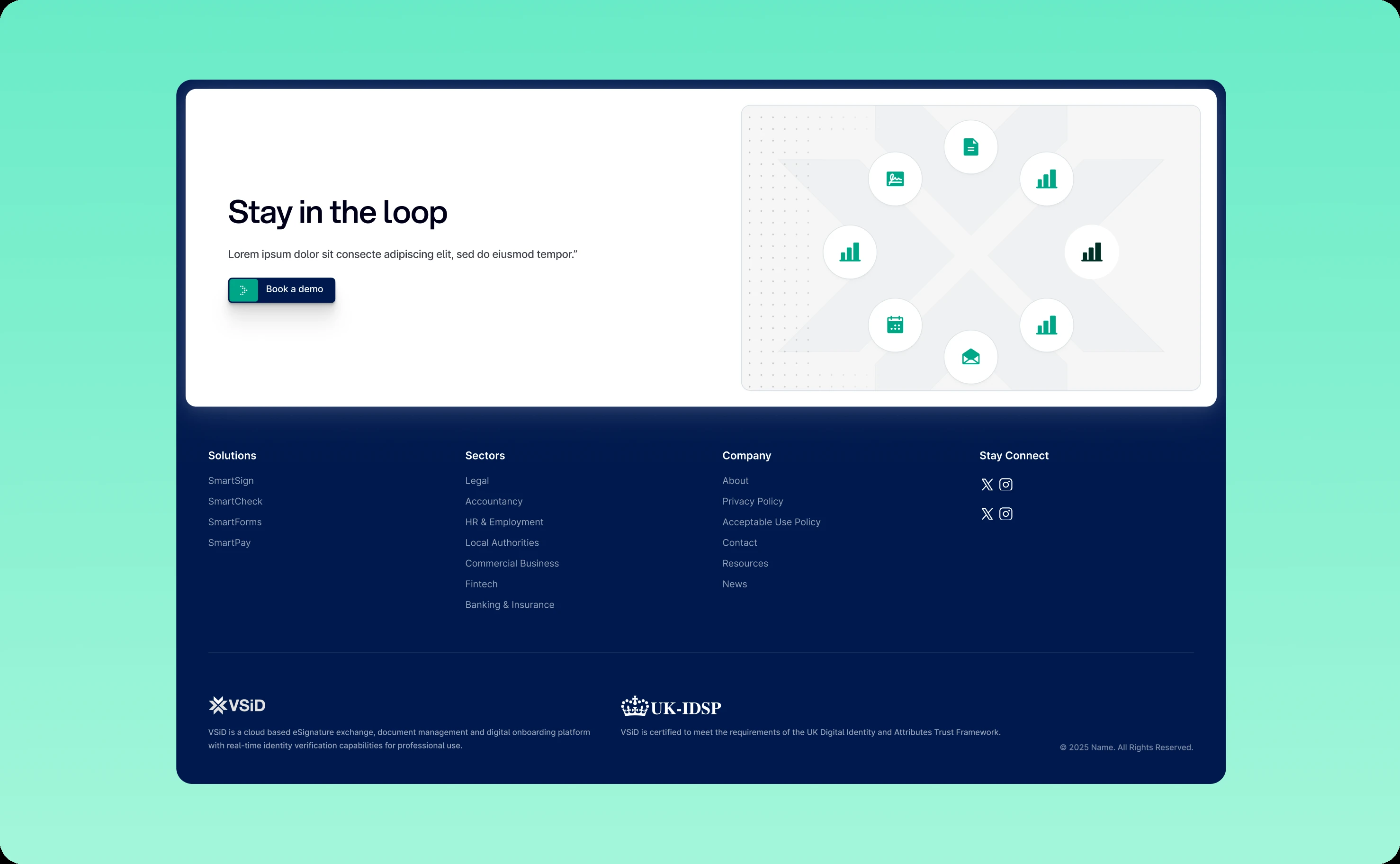
Building VSiD's corporate brand through solutions-driven website design
While modernizing Virtual Signature's product experience, we needed to establish VSiD as a trusted corporate brand offering multiple digital identity solutions.
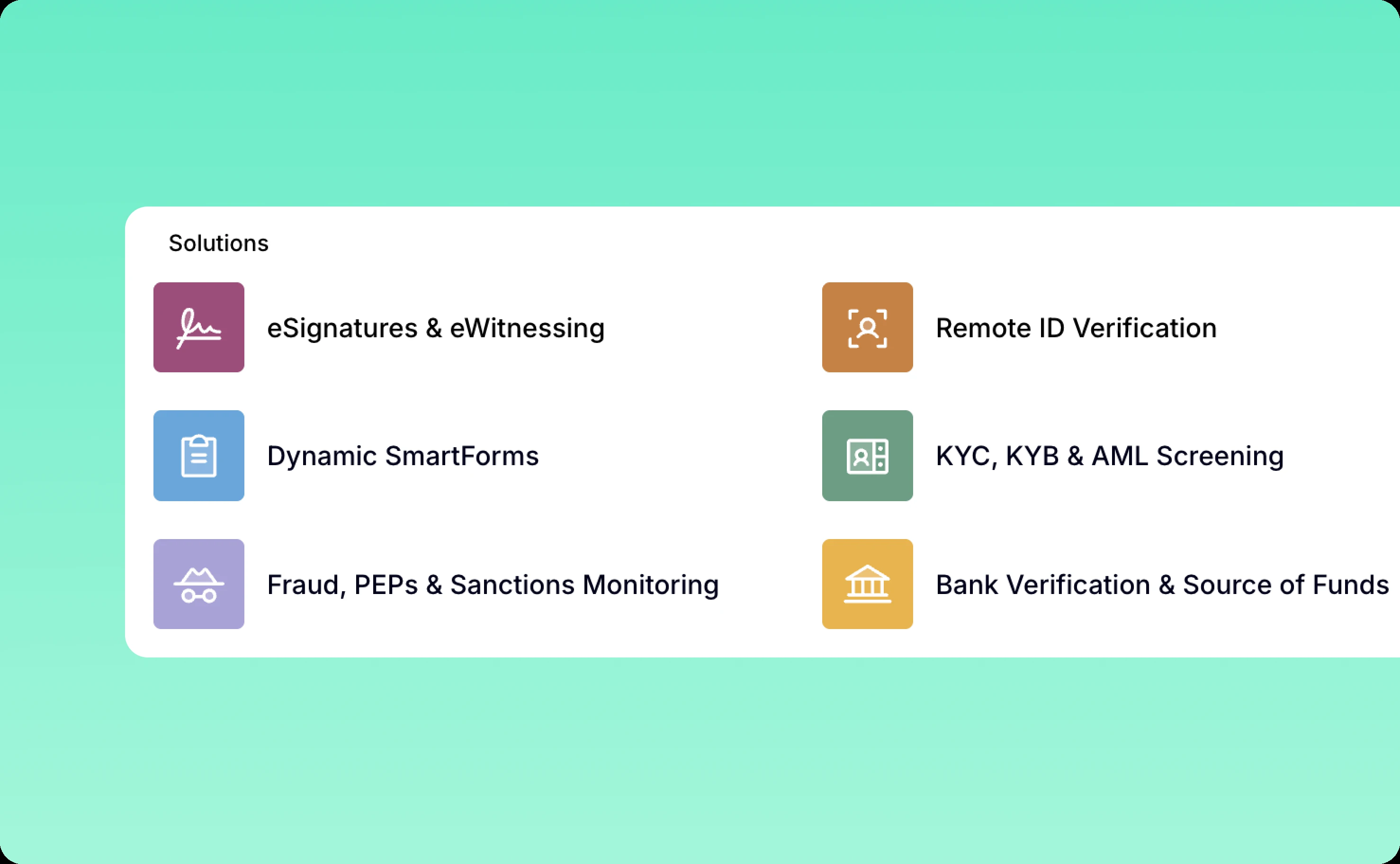
Solutions-driven architecture with visual differentiation
VSiD's portfolio includes multiple solutions serving different markets—e-signatures for document workflows, identity verification for compliance, authentication for secure access, and more. Each solution needed distinct identity while maintaining cohesive brand presence.
We created a solutions-driven website structure where each vertical has its own brand color. This creates a visual umbrella system: different enough to distinguish solutions at a glance, unified enough to feel like one trusted company.
Virtual Signature uses one color. Identity verification uses another. Authentication solutions use a third. This color-coding extends through navigation, landing pages, and solution-specific content, helping visitors quickly orient themselves within VSiD's ecosystem.
The approach solves a common multi-solution challenge: how do you present diverse offerings without creating brand confusion? The color system provides intuitive wayfinding while the consistent UI style—typography, spacing, component design—keeps everything feeling cohesive.
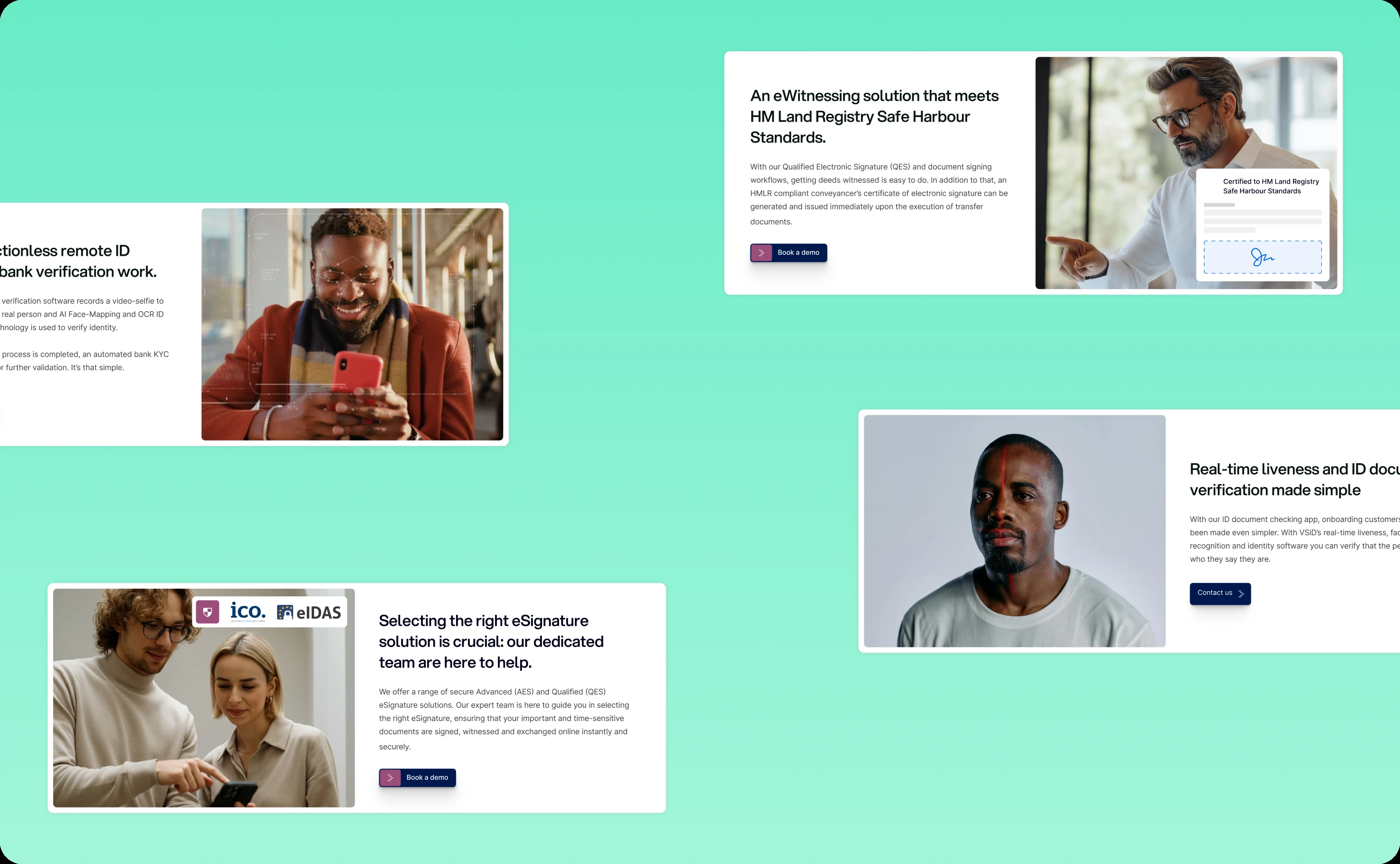
Custom graphics library that clarifies rather than decorates
Technical solutions often rely on stock imagery or generic illustrations that add visual interest without adding understanding. We took a different approach.
We developed a custom graphics library specifically designed to add context and clarify how solutions work. Each illustration serves a purpose: showing data flow, explaining security processes, visualizing workflow steps, or demonstrating integration points.
These aren't decorative graphics. They're explanatory tools that help visitors understand complex technical concepts quickly. Someone evaluating VSiD's identity verification solution can see immediately how the process works—document capture, validation, verification, confirmation—through clear visual storytelling.
The custom approach also differentiates VSiD from competitors using generic stock imagery. The graphics feel proprietary and purposeful, reinforcing VSiD's expertise and thoughtfulness.
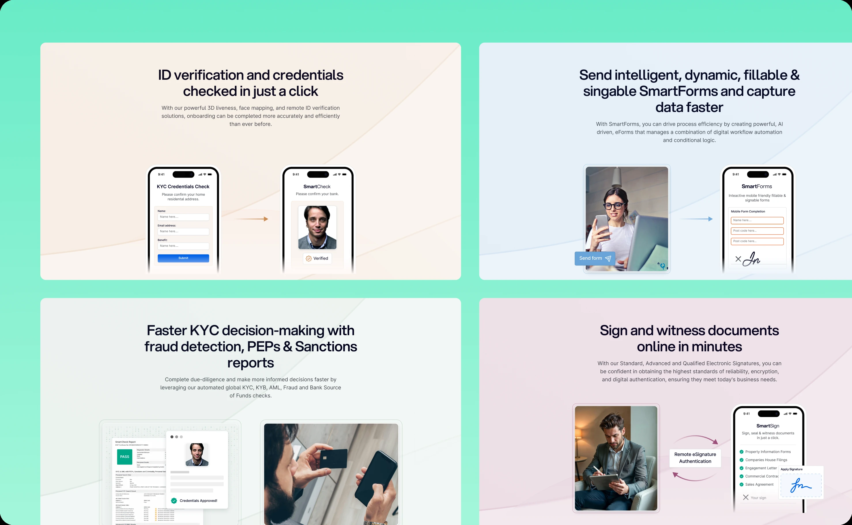
Humanizing technology through people imagery
Digital identity and e-signature solutions can feel sterile and impersonal—all about technology, security protocols, and compliance requirements. But ultimately, these tools serve people doing real work.
We integrated authentic people imagery throughout the website to build trust and humanize the entire experience. Real professionals in real work contexts. Diverse representation reflecting VSiD's global customer base. Images that show collaboration, relief, confidence—the emotional outcomes that good digital identity solutions enable.
This imagery strategy serves dual purposes:
Building credibility through relatability. Visitors see themselves reflected in the people using VSiD's solutions. Enterprise buyers recognize scenarios from their own operations. This creates implicit trust—"they understand our world."
Communicating outcomes over features. Instead of just describing what the technology does, the imagery shows how it improves work life. Less stress. More confidence. Efficient collaboration. These emotional benefits often matter more than technical specifications when decision-makers evaluate solutions.
The people-focused approach transforms VSiD's website from a technical product catalog into a vision of better, more secure, more efficient work.
Technical execution and testing
Design decisions were validated through iterative testing with real users from both product and website perspectives.
We created test mockups for critical Virtual Signature workflows, gathering feedback before full implementation. This surfaced usability issues early—a confusing button label, an unclear error message, a missing status indicator—when fixes were cheap.
Audit screens received particular attention. Compliance features can't just work—they need to demonstrate they work to regulators and internal compliance teams. We designed audit interfaces that make compliance verification straightforward, with clear documentation of every action and timestamp.
For the website, we tested with enterprise buyers to ensure the solutions-driven structure made sense, the color-coding system aided rather than confused navigation, and the custom graphics actually clarified concepts rather than just looking nice.
What the transformation delivered
Virtual Signature product improvements
The redesigned platform transformed VirtualSignature's user experience across all touchpoints.
Task completion times dropped 25%. Simplified workflows removed unnecessary steps. Clear guidance reduced errors. Users moved through processes confidently instead of tentatively.
User adoption increased 30%. The intuitive interface reduced training requirements and onboarding friction. New users could complete signing tasks without extensive instruction. Mid-users could manage workflows without constant support tickets.
Customer satisfaction improved noticeably. Enterprise clients reported higher completion rates on signing requests. Internal teams spent less time on user support and more time on strategic work.
VirtualSignature differentiated itself in a crowded market through modernized design that showcased their platform's sophistication without creating complexity. Security and compliance capabilities that once felt burdensome now feel seamless.
VSiD corporate brand establishment
The website successfully established VSiD's corporate identity and presented their solution portfolio with clarity.
The solutions-driven architecture with color-coding helped visitors navigate multiple offerings without confusion. Each solution felt distinct yet part of a cohesive family.
Custom graphics clarified complex concepts faster than text alone. Visitors understood technical capabilities without wading through specification documents.
People imagery humanized the brand, making VSiD feel approachable despite sophisticated technical offerings. The website balanced enterprise credibility with human connection.
VSiD now presents itself as a comprehensive digital identity company, not just an e-signature vendor. Virtual Signature serves as their flagship product within a broader portfolio of identity solutions.
The broader impact
This dual-focus project demonstrates that product excellence and brand presence must evolve together.
Virtual Signature's modernized UX showcases VSiD's capabilities through actual experience, not just marketing claims. When prospects try the product, they experience the thoughtfulness and usability that the website promises.
The website establishes credibility and context for the product line. Visitors understand VSiD's expertise, vision, and comprehensive approach to digital identity challenges. This corporate foundation supports Virtual Signature's sales while opening doors for other solutions in the portfolio.
For end-users, document signing stopped being a chore and became a forgettable transaction—which is exactly what it should be. For mid-users, case management became efficient workflow orchestration rather than manual tracking.
For enterprise clients evaluating digital identity solutions, they now see VSiD as the modern choice—technically robust, genuinely usable, and backed by a company with comprehensive expertise across the identity spectrum.
That's what happens when product refinement and brand establishment work in concert.
Related case studies